
Minimum Text Maximum Impact for Van Wrap Design
posted 17th September 2025
Why Less Is More in Van Wrap Design
When your van is out on the road, it becomes a moving billboard for your business. But here’s the thing: people only have a few seconds to look at it - whether you’re driving past them or they’re behind you in traffic.
That’s why minimal text, smart design, and bold visuals are the keys to making your van graphics work.
Many businesses fall into the trap of overloading their vehicle wraps with every single service they offer, a long list of phone numbers, website links, social handles, and sometimes even paragraphs of text.
Unfortunately, the result is often cluttered, hard to read, and visually overwhelming.
At Popin Graphics, we believe in "minimum text, maximum impact" - a principle that helps you grab attention, be memorable, and actually drive more enquiries.
The Psychology of Quick Glances
Imagine you’re driving at 30mph and glance at a van in the next lane.
You might get two or three seconds to take in what you see.
If the design is text-heavy, you simply won’t read it all.
☑️ Key insight: Most viewers will only notice three things:
- The company name or logo
- The main service you provide
- A point of contact (phone number or website)
If those three things are clear and prominent, the branding on your company van is doing the job you want it to do.
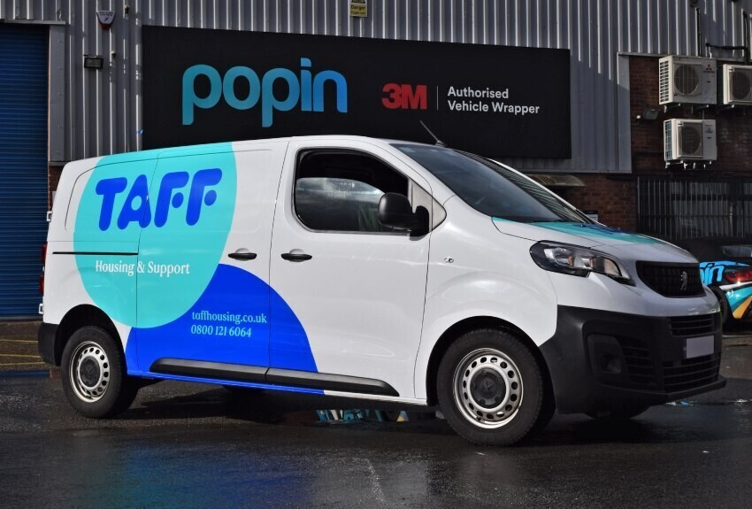
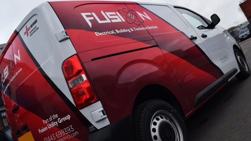
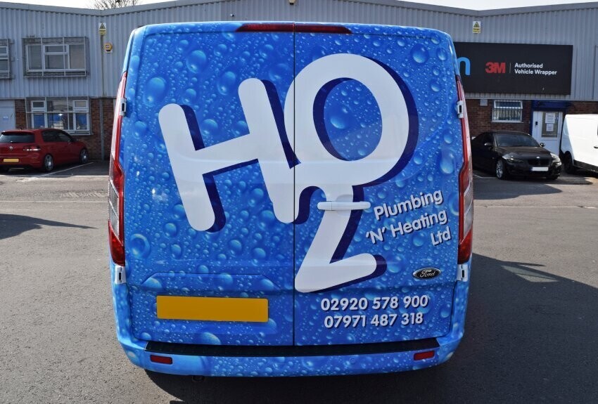
Clear and easy to read branding with simple yet striking design.
The Essentials Every Van Wrap Should Include
Here’s a simple checklist to get maximum value from your design:
| Element | Why It Matters | Best Practice |
|---|---|---|
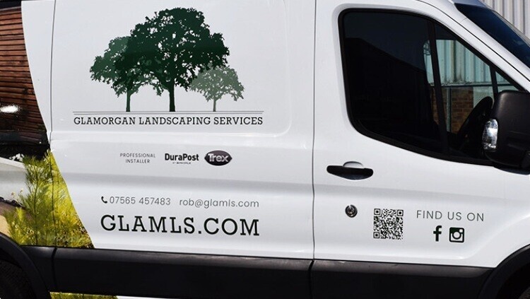
| Company Logo | Your brand identity - the one thing you want people to remember. | Make it large, clear, and visible on all sides of the vehicle. |
| Main Service | Tells people instantly what you do without making them guess. | Use broad categories like “Plumbing & Heating” or “Electrical Services”. |
| Contact Info | How customers will reach you when they need your service. | Stick to one or two key methods - phone number and/or website. Too many options can confuse. |
Why Too Much Text Hurts Your Message
1. Harder to Read at Speed
Most people will see your van while driving or walking past. Long lists of services like:
"Tap Replacement, Boiler Repairs, Central Heating Installation, Radiator Bleeding..."
are simply impossible to read on the move.
2. Less Visual Impact
Words take up space that could be used for striking graphics, bold colours, and clever branding that help you stand out.
3. Missed Branding Opportunity
Your van should make people curious, not give them your entire brochure in one go. The aim is to make them remember your name so they can look you up later.
Keep It Short and Sweet
A simple example:
Bad:
John Smith Plumbing | Tap Replacement | Sink Installation | Emergency Callouts | Boiler Servicing | Gas Safe Engineers | Water Pressure Fixing | Power Flushing | Radiator Repairs | Bathroom Installations
Better:
John Smith Plumbing
[Logo Here]
Website or Phone Number
[Logo Here]
Website or Phone Number
The second version is much more memorable - and a lot more visually striking when paired with colour and clean design.
Making the Most of Partial and Full Wraps
Colour is one of the best ways to stand out.
A plain white van with small vinyl text tends to blend into traffic, whereas a partial or full wrap creates a strong, professional impression.
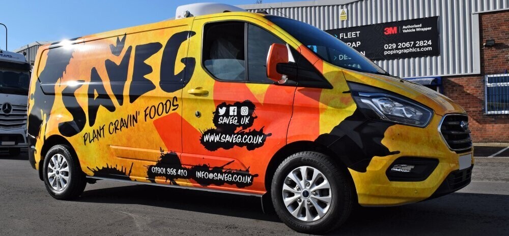
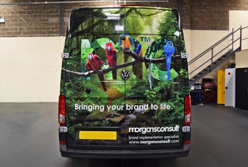
This colourful, high-quality branded full vehicle wrap instantly shows company owners and van fleet managers the value of investing in smart design rather than sticking with just basic text and sub-par graphics that struggle to cope with the rigours of daily exposure to all weathers.
Clever Use of the Rear Panel
The back of your company van is the one place where drivers have time to read more, especially in traffic.
You can include slightly more detail here, or really grab attention with something striking and visual:
- Tagline, slogan, or key selling point
- Short list of core services (consider a maximum of 3)
- Logo
- Website or social handle
- Contact number
- Attention-grabbing design
- Notable accreditations or affiliations
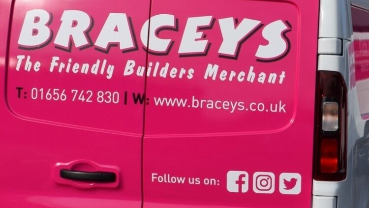
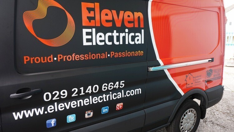
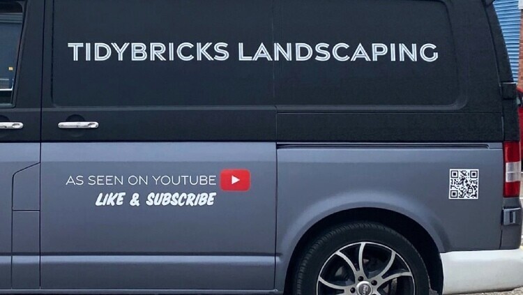
Social Media, Web Addresses & QR Codes
Rather than spelling out full URLs, use recognisable social media icons with your handle.
People know what to do when they see them.
Some businesses - especially those with a memorable name who are easily found on socials and who already have the company name or logo depicted strongly within their van wrap or graphic design - choose to include only the social media icons by themselves. When people see those icons they instantly know that those are the platforms they can find you on.
Example:
@SmithRemovals next to the Facebook, Instagram, X, or any other social media icons that your business wants to attract attention to is cleaner than writing:
facebook.com/smithremovals
Meanwhile, QR codes that are incorporated into a van wrap or graphic design can be a clever yet often underused marketing tool.
They are great for promoting a campaign that you may be running or simply directing potential customers to a specific landing page on your website or to any other type of online digital content.
For further reading, HubSpot put together this great piece on the advantages of fleet branding - well worth a read regardless of whether you operate a huge fleet of vehicles, one single company van, or a few.
Wrapping Things Up
Van wraps are one of the most cost-effective ways to market your business, but they need to be designed with care. By keeping your text minimal, focusing on your logo, main service, and a single contact point, you create a professional, memorable, and high-impact design that really works.
Think of your van as a moving advert, not a flyer - the simpler the message, the more powerful the impression.